Color accessibility: contrast and color blindness, explained simply
A design can look beautiful and still be unreadable for part of your audience. Color accessibility comes down to two things that are easy to check: enough contrast so text can be read, and not relying on color alone to convey information. Both can be verified in a couple of minutes.
1. Contrast: so the text can be read
Contrast measures how different the text is from its background. It's expressed as a ratio, from 1:1 (invisible) to 21:1 (black on white). The WCAG accessibility guidelines set minimums:
- Normal text: at least 4.5:1 (AA level), or 7:1 for AAA (stricter).
- Large text (headings): 3:1 (AA) is enough.
The typical mistake is light-gray text on a white background: it looks "elegant" but many people can't read it. Before calling a combination good, measure the ratio with a contrast checker: it tells you if it passes AA/AAA for normal and large text.
2. Color blindness: don't rely on color alone
About 8% of men have some form of color blindness (and a smaller percentage of women). The most common cases confuse red and green. That breaks patterns we take for granted:
- A chart that distinguishes categories only by red/green colors.
- A form where an error is marked by "turning the field red".
- A status light (green/yellow/red) with no text or icons.
The golden rule: color should never be the only signal. Always add something more —an icon, a word, a pattern, a different brightness— so the information is understood even if the color isn't perceived.
How to check your design in 2 steps
- Contrast: measure the text against its background with the checker; it should pass AA at minimum.
- Color blindness: simulate how your design looks with protanopia, deuteranopia, tritanopia and in grayscale. If something stops making sense, that information depended on color alone.
We tested it: contrast as a number, not by eye
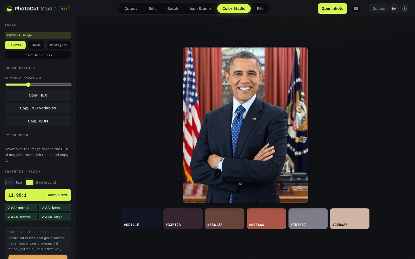
We combined a text color and a background color and the tool returned the WCAG contrast ratio (for example 11.98:1) with the AA and AAA badges in green or red depending on whether it passes. It's the difference between "I think it reads" and knowing it by the standard.
For real accessibility there's also a color blindness simulation: you see the palette as someone with different color vision perceives it, so you catch combinations that get confused. All local.
Quick best practices
- Body text always with high contrast; reserve light grays for secondary details, not for reading.
- States (success/error) with icon + text, not just color.
- In charts, combine color with labels, patterns or shapes.
- Try your palette in grayscale: if everything is distinguishable, you're on the right track.
All in your browser
Both the contrast checker and the color blindness simulator run locally: you upload an image or pick colors and everything is processed on your device, without uploading anything.
Frequently asked questions
What are WCAG AA and AAA contrast?
A difference ratio between text and background. For normal text, a minimum of 4.5:1 (AA) or 7:1 (AAA); for large text, 3:1 (AA).
Why shouldn't I use color alone to convey information?
Because about 8% of men have color blindness. Add another signal (icon, text, pattern) besides color.
How do I check if my design is accessible?
Measure the contrast (it should pass AA) and simulate color blindness to confirm the information doesn't depend on color alone.
Does accessibility affect SEO or just users?
It helps both: it improves the experience for everyone and is a valued best practice, but the main reason is that more people can use what you make.
Check my colors' accessibility →More guides and tools
Color blindness simulator
See how someone with color blindness sees your image or design and check accessibility.
How to choose a color palette
Roles, 50–900 scales and how to derive a palette from an image.