How to choose a color palette (for a website, brand or design)
Picking colors "by eye" is the fastest way to make a design look amateur. A good palette isn't a list of pretty colors: it's a system —a few colors with clear roles and their variants— that makes everything you build look coherent. This guide shows how to define a palette that works, how to derive it from an image you like, and how to get it ready for your project.
The most common mistake: too many colors with no role
Many people gather 8 or 10 colors they like and use them with no criteria. The result is noise. A professional palette is organized by roles, not by taste:
- Primary: your brand color, the one that repeats most (buttons, links, accents).
- Secondary / accent: one or two supporting colors to highlight specific things.
- Neutral: a gray scale for backgrounds, borders and text. It's the most used, even if it doesn't seem so.
- State: success (green), warning (amber), error (red), info (blue). Conventions users already understand.
Where to get the colors
You don't have to invent from scratch. The best palettes usually derive from a reference: a photo, a work of art, a product, a landscape. If you already have an image whose combination you love, extract its dominant colors with a palette extractor: you upload the image and get the exact HEX. From there, you assign roles.
Step by step
- Choose a reference whose color combination you like.
- Extract its dominant colors with their HEX.
- Assign roles: primary, secondary, neutral and states.
- Generate a scale for each color (light to dark).
- Export to CSS variables or Tailwind to use it consistently.
We tested it: from a photo to a usable palette
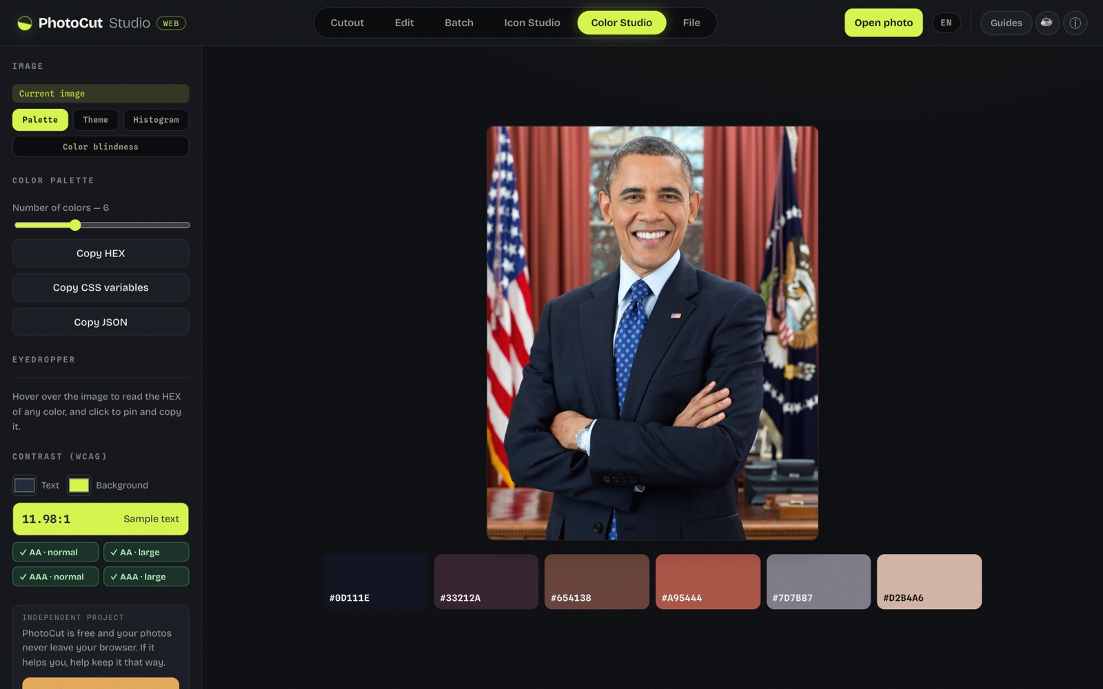
We loaded a photo and Color Studio extracted a 6-color palette (adjustable). The eyedropper shows the exact HEX as you move over the image, and with a click you pin and copy it.
The practical part for design and web: besides copying the HEX values, it exports the palette as CSS variables or JSON, ready to paste into a project. No sign-up and without uploading the image.
The 50–900 scales: the design-system trick
One version of a color isn't enough. You need the light primary for a soft
background, medium for a button, dark for text on light. That's why design
systems (Material, Tailwind) use scales: from
50 (almost white) to 900 (almost black), keeping
the hue. With a scale per role you have every variant you'll need without
improvising. Color Studio can generate these scales —and the semantic
tokens— and copy them as CSS or Tailwind, ready to paste.
Quick harmony rules
- 60-30-10: ~60% of a dominant color (almost always the neutral), 30% of the secondary and 10% of the accent. Keeps everything from competing.
- Contrast for text: text has to be readable. Aim for high contrast between text and background (check it with a contrast checker).
- A single strong accent: if everything shouts, nothing stands out. Reserve the most saturated color for what matters.
Don't forget accessibility
A pretty palette that can't be understood is useless. Two quick checks: enough contrast between text and background, and that information doesn't depend on color alone (around 8% of men have color blindness). You can simulate how your design looks with color blindness to be sure.
Frequently asked questions
How many colors should a palette have?
A primary, one or two secondary/accent colors, a neutral (grays) and state colors. With 3 to 5 base colors and their variants you can cover almost everything.
How do I pull a palette from an image?
With a palette extractor: you upload the image and get the dominant colors with their HEX.
What is a color scale (50 to 900)?
Variants of the same color, from lightest (50) to darkest (900), keeping the hue. The standard in design systems.
Does the palette work for people with color blindness?
It's worth checking: if information depends only on color, some of your users can't tell it apart. Simulate color blindness and mind the contrast.
Extract a palette from an image →More guides and tools
Color palette & HEX from an image
Pull the dominant colors from an image, generate 50–900 scales and copy CSS or Tailwind.
Color blindness simulator
Check whether your design reads without relying on color.